COM6018 Data Science with Python

Week 9 - Curve Fitting with scikit-learn

Jon Barker

UK-KT-AA

Copyright © 2023–2025 Jon Barker, University of Sheffield. All rights reserved.

Copyright © 2023–2025 Jon Barker, University of Sheffield. All rights reserved.

Copyright © 2023–2025 Jon Barker, University of Sheffield. All rights reserved.
COM6018 Data Science with Python

Overview

  • Review of Lab Class 8 (Face Recognition)
  • Group Feedback from Assignment 1
  • Overview of Assigmentment 2
  • Curve Fitting with scikit-learn
  • Preview of Lab Class 9 (Predicting CO2 Atmospheric Concentration)
Copyright © 2023–2025 Jon Barker, University of Sheffield. All rights reserved.
COM6018 Data Science with Python

Review of Lab Class 8

  • Building a system for face classification.
  • Using the 'Labeled Faces in the Wild' dataset.
  • Using scikit-learn to evaluate a range of approaches.

Copyright © 2023–2025 Jon Barker, University of Sheffield. All rights reserved.
COM6018 Data Science with Python

The Solution Notebook

The solutions to the lab have been released.

Open the Solution Notebook

Copyright © 2023–2025 Jon Barker, University of Sheffield. All rights reserved.
COM6018 Data Science with Python

Group Feedback from Assignment 1

Feedback for Questions 1 and 2.

(Q3 and Q4 will be covered next week)

Copyright © 2023–2025 Jon Barker, University of Sheffield. All rights reserved.
COM6018 Data Science with Python

Q1 Figure Requirements

  • Create a 3×4 grid of pie charts, one for each month January–December.
  • Each pie chart shows the percentage contribution of the following energy sources: solar, wind, gas, nuclear, imports and other (where ‘other’ is all remaining sources combined).
  • Use consistent colours for each energy source across all months.

Questions (answer from your plot):

  • In which month is the biggest percentage contribution from gas generation, and what is that percentage?
  • In which month is the smallest percentage contribution from solar generation, and what is that percentage?
Copyright © 2023–2025 Jon Barker, University of Sheffield. All rights reserved.
COM6018 Data Science with Python

Q1 Considerations

  • Is the data correct?
  • Is the plot easily readable?
  • Does the plot have a clear title?
  • Are the subplots labeled clearly?
  • Do the pie charts show the expected 6 countries?
  • Have the percentages been displayed with a sensible number of decimal places?
  • Are the segments labeled clearly with a legend or direct labels?
  • Is the caption complete and informative?
  • Is the question answered correctly?
Copyright © 2023–2025 Jon Barker, University of Sheffield. All rights reserved.
COM6018 Data Science with Python

Q1 Example Figures

Copyright © 2023–2025 Jon Barker, University of Sheffield. All rights reserved.
COM6018 Data Science with Python

Copyright © 2023–2025 Jon Barker, University of Sheffield. All rights reserved.
COM6018 Data Science with Python

Copyright © 2023–2025 Jon Barker, University of Sheffield. All rights reserved.
COM6018 Data Science with Python

Copyright © 2023–2025 Jon Barker, University of Sheffield. All rights reserved.
COM6018 Data Science with Python

Copyright © 2023–2025 Jon Barker, University of Sheffield. All rights reserved.
COM6018 Data Science with Python

Copyright © 2023–2025 Jon Barker, University of Sheffield. All rights reserved.
COM6018 Data Science with Python

Copyright © 2023–2025 Jon Barker, University of Sheffield. All rights reserved.
COM6018 Data Science with Python

Copyright © 2023–2025 Jon Barker, University of Sheffield. All rights reserved.
COM6018 Data Science with Python

Copyright © 2023–2025 Jon Barker, University of Sheffield. All rights reserved.
COM6018 Data Science with Python

Copyright © 2023–2025 Jon Barker, University of Sheffield. All rights reserved.
COM6018 Data Science with Python

Copyright © 2023–2025 Jon Barker, University of Sheffield. All rights reserved.
COM6018 Data Science with Python

Copyright © 2023–2025 Jon Barker, University of Sheffield. All rights reserved.
COM6018 Data Science with Python

Copyright © 2023–2025 Jon Barker, University of Sheffield. All rights reserved.
COM6018 Data Science with Python

Caption

  • Make is clear the data is for the UK and 2024.
  • Mention where the data is sourced from.
  • Explain what 'other' means.
  • Explain the purpose of the plot.
Copyright © 2023–2025 Jon Barker, University of Sheffield. All rights reserved.
COM6018 Data Science with Python

Q2 Plot requirements

Plot requirements:

  • Create a 2×2 grid of line plots showing average energy generation (MW) by time of day (0–24 h).
  • Each panel corresponds to a 3-month season (Winter, Spring, Summer, Autumn). Consider Dec-Jan-Feb to be Winter; Mar-Apr-May to be Spring; Jun-Jul-Aug to be Summer; and Sep-Oct-Nov to be Autumn.
  • Include separate lines for solar, wind, gas, and nuclear.
  • Keep the y-axis comparable across panels so seasonal differences are visible.
Copyright © 2023–2025 Jon Barker, University of Sheffield. All rights reserved.
COM6018 Data Science with Python

Q2 Plot requirements (continued)

Questions (answer from your plot):

  • At what time of day does gas generation peak in winter, and what is the total gas generation (in MW) at that peak?
  • At what time of day does gas generation peak in summer, and what is the total gas generation (in MW) at that peak?
Copyright © 2023–2025 Jon Barker, University of Sheffield. All rights reserved.
COM6018 Data Science with Python

Q2 Considerations

  • Is the data correct?
  • Does the plot conform to the requirements?
  • Is the plot easily readable?
  • Are axes labeled clearly (including units)?
  • Has the y-axis been kept consistent across subplots?
  • Are grid and tick marks used well to aid readability?
  • Does the plot or caption define the seasons?
  • Is the questioned answered correctly and from the plot?
Copyright © 2023–2025 Jon Barker, University of Sheffield. All rights reserved.
COM6018 Data Science with Python

Question answer

Winter peak:

  • 17:00, 17:30, 18:00 accepted
  • 14000 MW, 14100 MW accepted

Summer peak:

  • 19:30, 20:00, 20:30 accepted
  • 8000 MW, 8100 MW, 8200 MW accepted

Marks lost if time or peak reported too precisely (e.g. 14023 MW)
Marks lost if value does not match the plot

Copyright © 2023–2025 Jon Barker, University of Sheffield. All rights reserved.
COM6018 Data Science with Python

Q2 Example Plots

Copyright © 2023–2025 Jon Barker, University of Sheffield. All rights reserved.
COM6018 Data Science with Python

Copyright © 2023–2025 Jon Barker, University of Sheffield. All rights reserved.
COM6018 Data Science with Python

Copyright © 2023–2025 Jon Barker, University of Sheffield. All rights reserved.
COM6018 Data Science with Python

Copyright © 2023–2025 Jon Barker, University of Sheffield. All rights reserved.
COM6018 Data Science with Python

Copyright © 2023–2025 Jon Barker, University of Sheffield. All rights reserved.
COM6018 Data Science with Python

Copyright © 2023–2025 Jon Barker, University of Sheffield. All rights reserved.
COM6018 Data Science with Python

Copyright © 2023–2025 Jon Barker, University of Sheffield. All rights reserved.
COM6018 Data Science with Python

Copyright © 2023–2025 Jon Barker, University of Sheffield. All rights reserved.
COM6018 Data Science with Python

Copyright © 2023–2025 Jon Barker, University of Sheffield. All rights reserved.
COM6018 Data Science with Python

Copyright © 2023–2025 Jon Barker, University of Sheffield. All rights reserved.
COM6018 Data Science with Python

Copyright © 2023–2025 Jon Barker, University of Sheffield. All rights reserved.
COM6018 Data Science with Python

Copyright © 2023–2025 Jon Barker, University of Sheffield. All rights reserved.
COM6018 Data Science with Python

Copyright © 2023–2025 Jon Barker, University of Sheffield. All rights reserved.
COM6018 Data Science with Python

Copyright © 2023–2025 Jon Barker, University of Sheffield. All rights reserved.
COM6018 Data Science with Python

Copyright © 2023–2025 Jon Barker, University of Sheffield. All rights reserved.
COM6018 Data Science with Python

Copyright © 2023–2025 Jon Barker, University of Sheffield. All rights reserved.
COM6018 Data Science with Python

Curve Fitting with scikit-learn

This week we will be looking at scikit-learn to perform regression.

  • Using curve fitting as an example.
    • Fitting noisy data with a polynomial function.
    • Fitting periodic data with sine and cosine functions.
  • Estimating parameters using linear regression.
Copyright © 2023–2025 Jon Barker, University of Sheffield. All rights reserved.
COM6018 Data Science with Python

Curve Fitting with scikit-learn Tutorial

Link to the Curve Fitting with scikit-learn tutorial

Copyright © 2023–2025 Jon Barker, University of Sheffield. All rights reserved.
COM6018 Data Science with Python

Lab Class 9 Preview

We will use scikit-learn to fit the CO2 atmospheric concentration data.
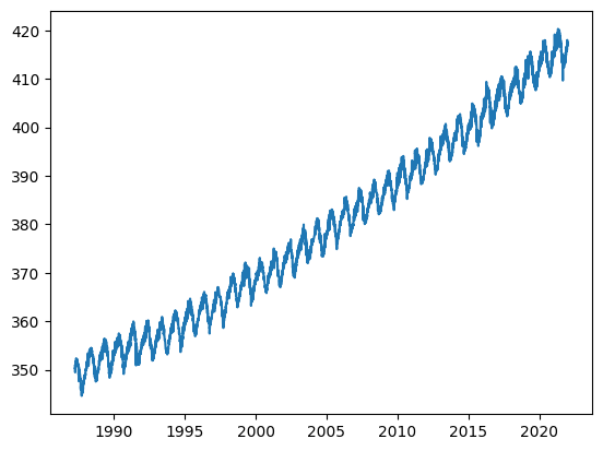
We will then use our model to predict future CO2 atmospheric concentration.

On what date will the CO2 atmospheric concentration reach 450 ppm?

Copyright © 2023–2025 Jon Barker, University of Sheffield. All rights reserved.
COM6018 Data Science with Python

Lab Class 9 Preview

Link to lab class

Copyright © 2023–2025 Jon Barker, University of Sheffield. All rights reserved.
COM6018 Data Science with Python

Next Steps

  • Complete/Review Lab Class 8:

    • Complete the Face Recognition lab.
    • We will be using this data in Assignment 2 (released next Monday)
  • Prepare for Lab Class 9:

    • Read through the "Curve fitting with scikit-learn" tutorial.
  • Marks and some individual feedback for Assignment 1 will be released on Friday

Copyright © 2023–2025 Jon Barker, University of Sheffield. All rights reserved.