050 Using Matplotlib#
COM6018
Copyright © 2023–2025 Jon Barker, University of Sheffield. All rights reserved.
In this lab class we are going to get practice with using Matplotlib. We will be using the Matplotlib documentation and the Introducing Matplotlib course notes as a reference.
The lab class is organised as a sequence of exercises. For each one you are provided with a dataset and an image of a plot of the data. Your task is to write code to reproduce the plot as closely as possible. After the lab class the solution code will be released so you can check your answers. The exercises start with simple plots and get progressively more complex.
import matplotlib.pyplot as plt
import numpy as np
import pandas as pd
Plot 1 - Simple line plot#
The first plot is a simple line plot. The plot, shown below, shows worldwide renewable energy consumption from 1989 to 2022. The data for the plot is in file data/renewable_energy.csv. Your task is to write code to reproduce the plot as closely as possible.
Some hints:
You will need to filter the Pandas DataFrame to select only the data for the ‘World’ region.
You can read the data using Pandas
read_csvfunction.The plotting can be done with a series of calls to
plt.plot.Getting the grid lines right is a bit tricky. You’ll need to use the
plt.gridfunction andplt.yticksto set the spacing of major and minor tick marks.
Write your code in the cell below. Run the cell to display your plot and make adjustments to the code until it matches the target plot.
# SOLUTION

df = pd.read_csv('data/renewable_energy.csv')

df = df[df['Entity'] == 'World']

plt.plot(df['Year'], df['Other'], label='Other', marker='o', color='blue', linewidth=1, markersize=5)
plt.plot(df['Year'], df['Wind'], label='Wind', marker='*', color='orange', linewidth=1, markersize=5)
plt.plot(df['Year'], df['Hydro'], label='Hydro', marker='^', color='green', linewidth=1, markersize=5)
plt.plot(df['Year'], df['Solar'], label='Solar', marker='v', color='red', linewidth=1, markersize=5)

plt.xlabel('Year')

major_ticks = np.arange(0, 5000, 1000)
minor_ticks = np.arange(0, 5000, 200)
plt.yticks(major_ticks)
plt.yticks(minor_ticks, minor=True)
plt.grid(which='both', axis='both', linestyle='--', linewidth=0.5, color='grey', alpha=0.3)

plt.ylabel('Renewable Energy Consumption (TWh)')
plt.title('Worldwide Renewable Energy Consumption')
plt.legend()

plt.savefig('figures/energy.png', dpi=600)
Plot 1b - Using subplots#
The second plot uses the same data but uses subplots to compare energy consumption for the world, the EU and the UK.
Hints:
Start with the command
plt.figure(figsize=(15, 5))to set the size of the figure.You can use the
plt.subplotcommand to place the subplots on a 1x3 grid.Write a function to generate each subplot, i.e. the function can take a filtered version of the DataFrame and a title string as arguments.
# SOLUTION

def make_renewable_plot(ax, df, title):
    ax.plot(df['Year'], df['Other'], label='Other', marker='o', color='blue', linewidth=1, markersize=5)
    ax.plot(df['Year'], df['Wind'],  label='Wind',  marker='*', color='orange', linewidth=1, markersize=5)
    ax.plot(df['Year'], df['Hydro'], label='Hydro', marker='^', color='green', linewidth=1, markersize=5)
    ax.plot(df['Year'], df['Solar'], label='Solar', marker='v', color='red', linewidth=1, markersize=5)
    ax.set_xlabel('Year')
    ax.set_ylabel('Renewable Energy Consumption (TWh)')
    ax.grid(which='both', axis='both', linestyle='--', linewidth=0.5, color='grey', alpha=0.3)
    ax.set_title(title)
    ax.legend()

df = pd.read_csv('data/renewable_energy.csv')

fig, axes = plt.subplots(1, 3, figsize=(15, 5))
make_renewable_plot(axes[0], df[df['Entity'] == 'World'], 'Worldwide')
make_renewable_plot(axes[1], df[df['Entity'] == 'EU'],     'EU')
make_renewable_plot(axes[2], df[df['Entity'] == 'UK'],     'UK')

fig.tight_layout()
fig.savefig('figures/energy_subplots.png', dpi=600)
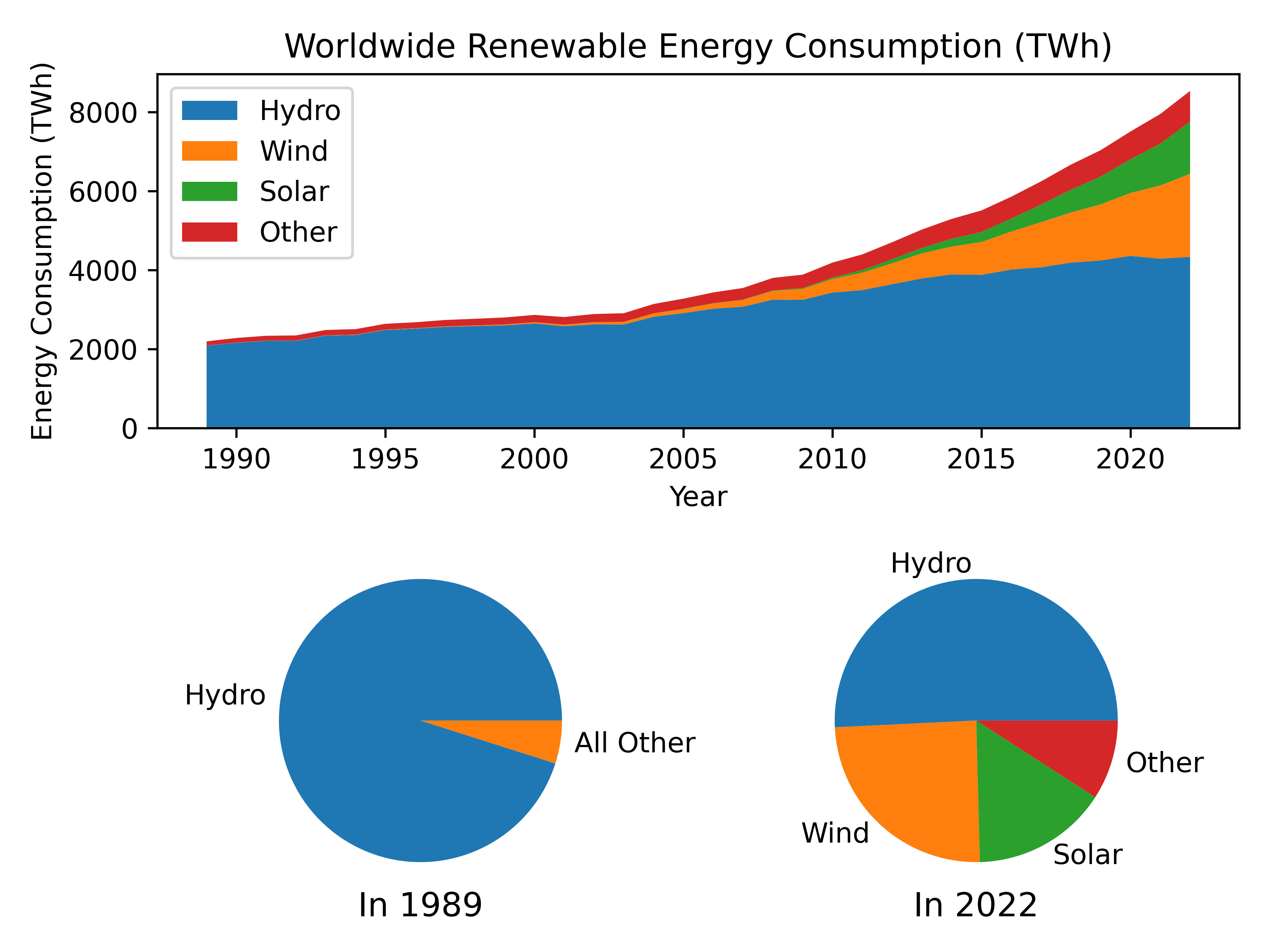
Plot 2 - Stackplot and pie charts#
The next plot shows the same worldwide energy consumption data but this time as a ‘stackplot’. There are also two pie charts showing the proportion of energy of each type in 1989 and 2022.
Hints:
The layout can be made using plt.subplot.
You can use the
plt.stackplotfunction to generate the stackplot. Check the Matplotlib documentation for details.The pie charts can be made with
plt.pie. Again, check the documentation for details.You will need to retrieve the first and last value in each data series to use as the data for the pie charts (i.e. 1989 and 2022). You can do this using the
ilocmethod of the DataFrame.Note, the first pie chart groups wind, solar and other into ‘all other’.
# SOLUTION

df = pd.read_csv('data/renewable_energy.csv')

df = df[df['Entity'] == 'World']

plt.subplot(2, 1, 1)

plt.stackplot(df['Year'],  df['Hydro'], df['Wind'], df['Solar'], df['Other'], labels=['Hydro', 'Wind', 'Solar', 'Other'])
plt.ylabel('Energy Consumption (TWh)')
plt.xlabel('Year')
plt.title('Worldwide Renewable Energy Consumption (TWh)')
plt.legend(loc='upper left')
plt.subplot(2, 2, 3)
plt.pie([df.iloc[0]['Hydro'], df.iloc[0]['Wind'] + df.iloc[0]['Solar'] + df.iloc[0]['Other']], labels=['Hydro', 'All Other'])
plt.title('In 1989', y=-0.1)
plt.subplot(2, 2, 4)
plt.pie([df.iloc[-1]['Hydro'], df.iloc[-1]['Wind'], df.iloc[-1]['Solar'], df.iloc[-1]['Other']], labels=['Hydro', 'Wind', 'Solar', 'Other'])
plt.title('In 2022', y=-0.1)
plt.tight_layout()

plt.savefig('figures/energy_stacked.png', dpi=600)
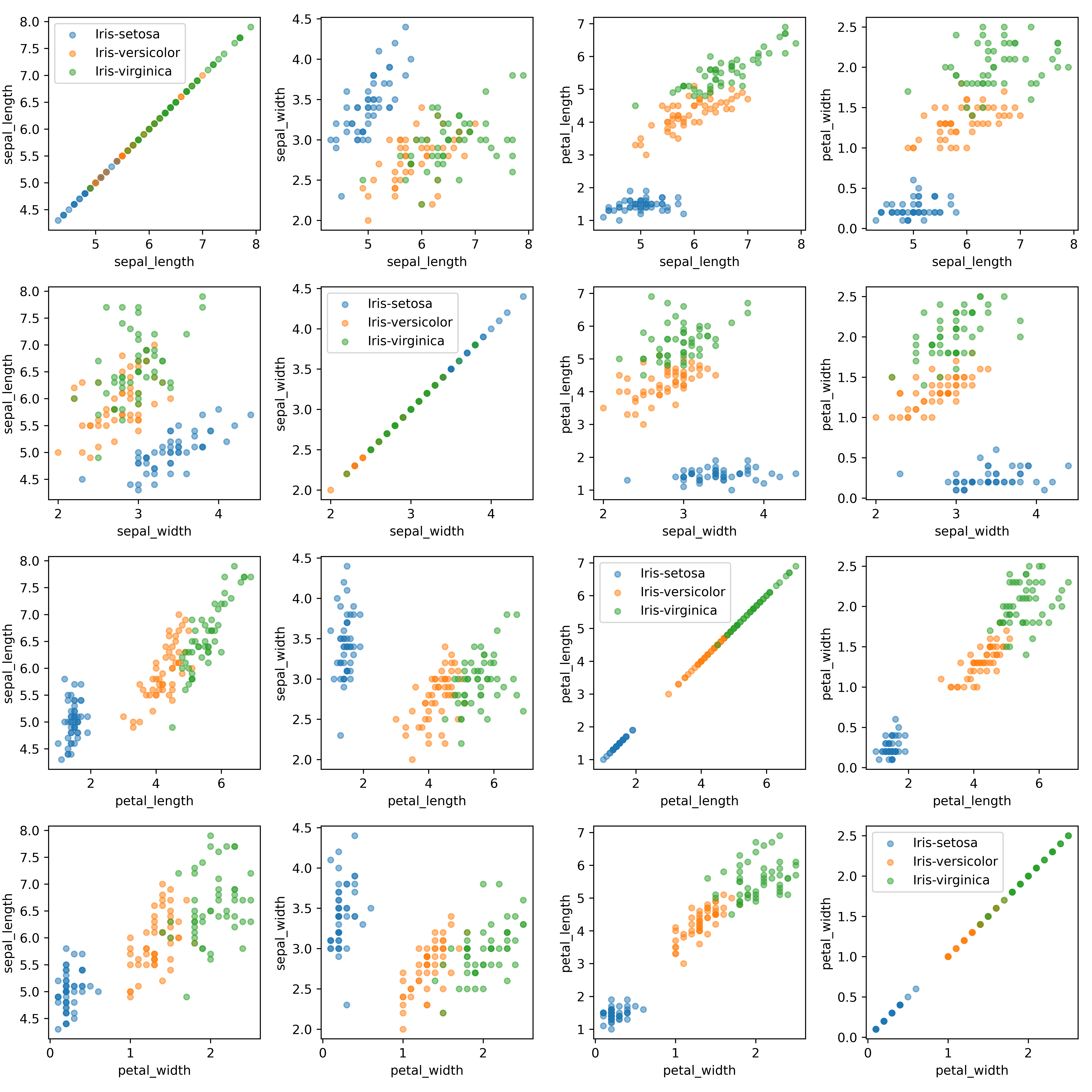
Plot 3 - Grid of scatter plots#
The next plot illustrates a famous dataset known as the ‘iris’ dataset. The dataset contains measurements of the sepal and petal length and width for three species of iris flower. This dataset was first published in 1936 by the British statistician and biologist Ronald Fisher. The dataset is widely used in machine learning and data science to illustrate classification and clustering algorithms.
The plot shows a grid of scatter plots comparing each pair of measurements. The data is in file data/iris.csv.
This plot is a bit more complex than the previous ones.
Hints:
Write a function that can generate each subplot. The function should take the dataframe and the column names for the x and y axes as arguments.
Use a nested loop to loop over all combinations of x and y axes.
Note, the legend has only been placed on the diagonal subplots where it doesn’t overlap with the data.
You can use the
plt.tight_layout()function as the final command to ensure that the subplot axis labels don’t overlap other subplots.
# SOLUTION

df = pd.read_csv('data/iris.csv')

def plot_scatter(ax, df, x, y, species_list):
    for species in species_list:
        subset = df[df['species'] == species]
        ax.scatter(subset[x], subset[y], label=species, marker='o', s=20, alpha=0.5)
    ax.set_xlabel(x)
    ax.set_ylabel(y)
    if x == y:
        ax.legend()

features = ['sepal_length', 'sepal_width', 'petal_length', 'petal_width']
species_list = df['species'].unique()

fig, axes = plt.subplots(4, 4, figsize=(12, 12))
for i, f1 in enumerate(features):
    for j, f2 in enumerate(features):
        plot_scatter(axes[i, j], df, f1, f2, species_list)

fig.tight_layout()
fig.savefig('figures/iris_scatter.png', dpi=600)
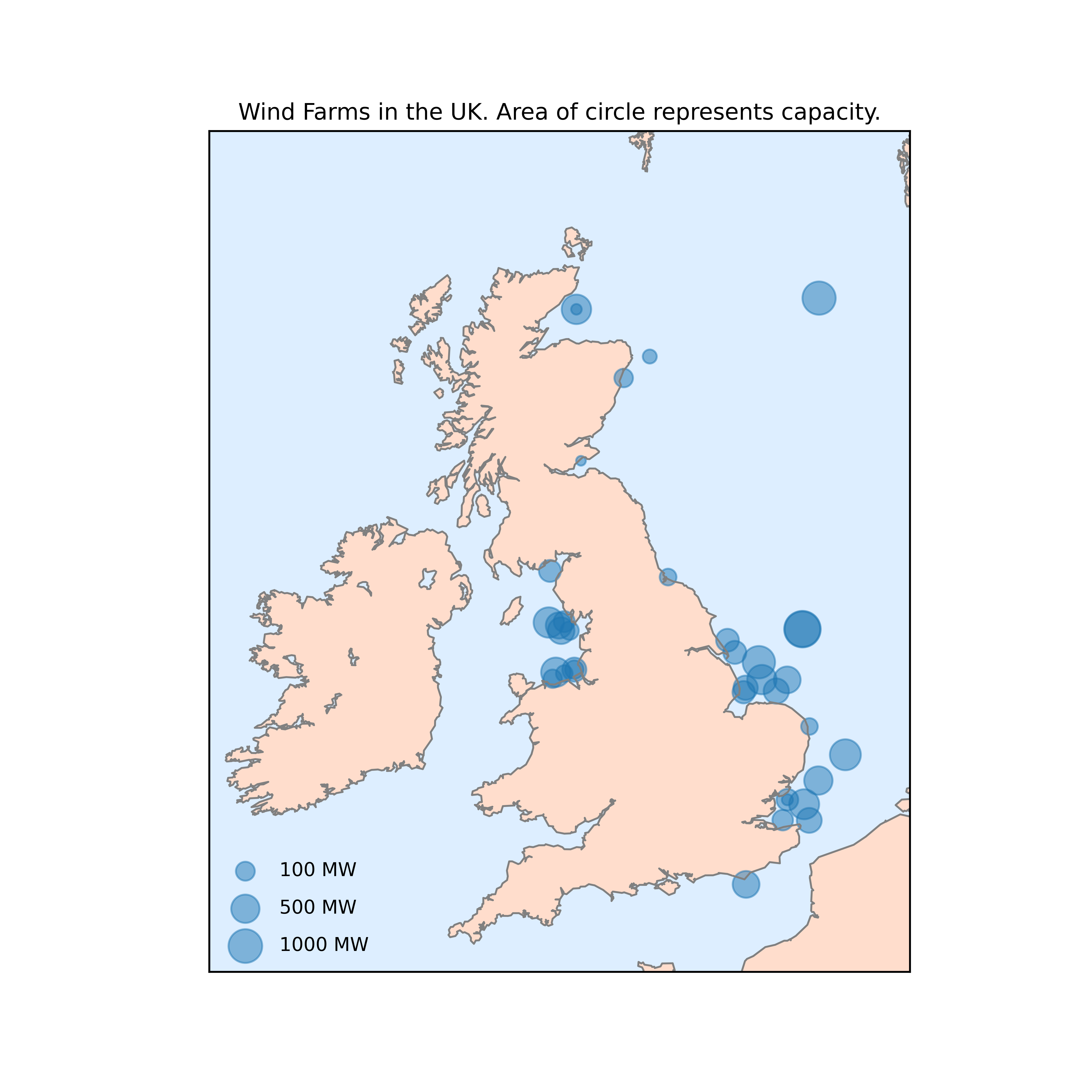
Plot 4 - Geographic data plot#
The next plot shows the location and generation capacity of wind farms in the UK. The data is in file data/wind_farms_uk.csv. The plot is basically a scatter plot but the points are shown over a map of the UK. This has been achieved using the cartopy package for plotting geographic data.
The first lines of the solution are as follows
import cartopy.crs as ccrs
import cartopy.feature as cfeature

df = pd.read_csv('data/wind_farms_uk.csv')
fig = plt.figure(figsize=(8, 8))

ax = plt.axes(projection=ccrs.Mercator())
ax.set_extent([-11, 3, 49.3, 60], crs=ccrs.PlateCarree())
You will now need to use the ax.scatter function to plot the wind farm locations.
Hints:
The area of the circles is proportional to the square root of the wind farm capacity.
You will need to use
ax.scatterwith the parameter ‘transform=ccrs.PlateCarree()’You will need to read the documentation at https://scitools.org.uk/cartopy to see how to shade the land and sea.
The legend in the bottom left corner is quite tricky to generate. It can be made by placing invisible ‘dummy’ points on the plot that have labels attached. Try Googling for a solution but don’t worry if you can’t get this bit to work, wait for the solution code to be released.
# SOLUTION

import cartopy.crs as ccrs
import cartopy.feature as cfeature
import matplotlib as mpl
import matplotlib.pyplot as plt

# Speed up rendering of complex paths (optional)
mpl.rcParams['agg.path.chunksize'] = 10000

fig = plt.figure(figsize=(8, 8))

df = pd.read_csv('data/wind_farms_uk.csv')

ax = plt.axes(projection=ccrs.Mercator())
ax.set_extent([-11, 3, 49.3, 60], crs=ccrs.PlateCarree())
ax.coastlines(resolution='50m')  # Can also set to '10m' but will be slower to render
ax.add_feature(cfeature.LAND, zorder=1, edgecolor='k')
ax.add_feature(cfeature.OCEAN, zorder=1, edgecolor='k')
marker_sizes = np.sqrt(df['capacity'].values) * 10

ax.scatter(df['longitude'].values,
           df['latitude'].values,
           transform=ccrs.PlateCarree(),
           s=marker_sizes,
           alpha=0.5)

ax.set_title('Wind Farms in the UK. Area of circle represents capacity.')
for a in [100, 500, 1000]:
    ax.scatter([], [], c='#1f77b4', alpha=0.5, s=np.sqrt(a)*10,
                label=str(a) + ' MW')
ax.legend(scatterpoints=1, frameon=False, labelspacing=1, loc='lower left')

plt.savefig('figures/wind_farms.png', dpi=600)
/opt/hostedtoolcache/Python/3.11.14/x64/lib/python3.11/site-packages/cartopy/io/__init__.py:242: DownloadWarning: Downloading: https://naturalearth.s3.amazonaws.com/10m_physical/ne_10m_land.zip
  warnings.warn(f'Downloading: {url}', DownloadWarning)
/opt/hostedtoolcache/Python/3.11.14/x64/lib/python3.11/site-packages/cartopy/io/__init__.py:242: DownloadWarning: Downloading: https://naturalearth.s3.amazonaws.com/10m_physical/ne_10m_ocean.zip
  warnings.warn(f'Downloading: {url}', DownloadWarning)
---------------------------------------------------------------------------
KeyboardInterrupt                         Traceback (most recent call last)
Cell In[6], line 34
     30     ax.scatter([], [], c='#1f77b4', alpha=0.5, s=np.sqrt(a)*10,
     31                 label=str(a) + ' MW')
     32 ax.legend(scatterpoints=1, frameon=False, labelspacing=1, loc='lower left')
---> 34 plt.savefig('figures/wind_farms.png', dpi=600)

File /opt/hostedtoolcache/Python/3.11.14/x64/lib/python3.11/site-packages/matplotlib/pyplot.py:1250, in savefig(*args, **kwargs)
   1247 fig = gcf()
   1248 # savefig default implementation has no return, so mypy is unhappy
   1249 # presumably this is here because subclasses can return?
-> 1250 res = fig.savefig(*args, **kwargs)  # type: ignore[func-returns-value]
   1251 fig.canvas.draw_idle()  # Need this if 'transparent=True', to reset colors.
   1252 return res

File /opt/hostedtoolcache/Python/3.11.14/x64/lib/python3.11/site-packages/matplotlib/figure.py:3490, in Figure.savefig(self, fname, transparent, **kwargs)
   3488     for ax in self.axes:
   3489         _recursively_make_axes_transparent(stack, ax)
-> 3490 self.canvas.print_figure(fname, **kwargs)

File /opt/hostedtoolcache/Python/3.11.14/x64/lib/python3.11/site-packages/matplotlib/backend_bases.py:2186, in FigureCanvasBase.print_figure(self, filename, dpi, facecolor, edgecolor, orientation, format, bbox_inches, pad_inches, bbox_extra_artists, backend, **kwargs)
   2182 try:
   2183     # _get_renderer may change the figure dpi (as vector formats
   2184     # force the figure dpi to 72), so we need to set it again here.
   2185     with cbook._setattr_cm(self.figure, dpi=dpi):
-> 2186         result = print_method(
   2187             filename,
   2188             facecolor=facecolor,
   2189             edgecolor=edgecolor,
   2190             orientation=orientation,
   2191             bbox_inches_restore=_bbox_inches_restore,
   2192             **kwargs)
   2193 finally:
   2194     if bbox_inches and restore_bbox:

File /opt/hostedtoolcache/Python/3.11.14/x64/lib/python3.11/site-packages/matplotlib/backend_bases.py:2042, in FigureCanvasBase._switch_canvas_and_return_print_method.<locals>.<lambda>(*args, **kwargs)
   2038     optional_kws = {  # Passed by print_figure for other renderers.
   2039         "dpi", "facecolor", "edgecolor", "orientation",
   2040         "bbox_inches_restore"}
   2041     skip = optional_kws - {*inspect.signature(meth).parameters}
-> 2042     print_method = functools.wraps(meth)(lambda *args, **kwargs: meth(
   2043         *args, **{k: v for k, v in kwargs.items() if k not in skip}))
   2044 else:  # Let third-parties do as they see fit.
   2045     print_method = meth

File /opt/hostedtoolcache/Python/3.11.14/x64/lib/python3.11/site-packages/matplotlib/backends/backend_agg.py:481, in FigureCanvasAgg.print_png(self, filename_or_obj, metadata, pil_kwargs)
    434 def print_png(self, filename_or_obj, *, metadata=None, pil_kwargs=None):
    435     """
    436     Write the figure to a PNG file.
    437
   (...)    479         *metadata*, including the default 'Software' key.
    480     """
--> 481     self._print_pil(filename_or_obj, "png", pil_kwargs, metadata)

File /opt/hostedtoolcache/Python/3.11.14/x64/lib/python3.11/site-packages/matplotlib/backends/backend_agg.py:429, in FigureCanvasAgg._print_pil(self, filename_or_obj, fmt, pil_kwargs, metadata)
    424 def _print_pil(self, filename_or_obj, fmt, pil_kwargs, metadata=None):
    425     """
    426     Draw the canvas, then save it using `.image.imsave` (to which
    427     *pil_kwargs* and *metadata* are forwarded).
    428     """
--> 429     FigureCanvasAgg.draw(self)
    430     mpl.image.imsave(
    431         filename_or_obj, self.buffer_rgba(), format=fmt, origin="upper",
    432         dpi=self.figure.dpi, metadata=metadata, pil_kwargs=pil_kwargs)

File /opt/hostedtoolcache/Python/3.11.14/x64/lib/python3.11/site-packages/matplotlib/backends/backend_agg.py:382, in FigureCanvasAgg.draw(self)
    379 # Acquire a lock on the shared font cache.
    380 with (self.toolbar._wait_cursor_for_draw_cm() if self.toolbar
    381       else nullcontext()):
--> 382     self.figure.draw(self.renderer)
    383     # A GUI class may be need to update a window using this draw, so
    384     # don't forget to call the superclass.
    385     super().draw()

File /opt/hostedtoolcache/Python/3.11.14/x64/lib/python3.11/site-packages/matplotlib/artist.py:94, in _finalize_rasterization.<locals>.draw_wrapper(artist, renderer, *args, **kwargs)
     92 @wraps(draw)
     93 def draw_wrapper(artist, renderer, *args, **kwargs):
---> 94     result = draw(artist, renderer, *args, **kwargs)
     95     if renderer._rasterizing:
     96         renderer.stop_rasterizing()

File /opt/hostedtoolcache/Python/3.11.14/x64/lib/python3.11/site-packages/matplotlib/artist.py:71, in allow_rasterization.<locals>.draw_wrapper(artist, renderer)
     68     if artist.get_agg_filter() is not None:
     69         renderer.start_filter()
---> 71     return draw(artist, renderer)
     72 finally:
     73     if artist.get_agg_filter() is not None:

File /opt/hostedtoolcache/Python/3.11.14/x64/lib/python3.11/site-packages/matplotlib/figure.py:3257, in Figure.draw(self, renderer)
   3254             # ValueError can occur when resizing a window.
   3256     self.patch.draw(renderer)
-> 3257     mimage._draw_list_compositing_images(
   3258         renderer, self, artists, self.suppressComposite)
   3260     renderer.close_group('figure')
   3261 finally:

File /opt/hostedtoolcache/Python/3.11.14/x64/lib/python3.11/site-packages/matplotlib/image.py:134, in _draw_list_compositing_images(renderer, parent, artists, suppress_composite)
    132 if not_composite or not has_images:
    133     for a in artists:
--> 134         a.draw(renderer)
    135 else:
    136     # Composite any adjacent images together
    137     image_group = []

File /opt/hostedtoolcache/Python/3.11.14/x64/lib/python3.11/site-packages/matplotlib/artist.py:71, in allow_rasterization.<locals>.draw_wrapper(artist, renderer)
     68     if artist.get_agg_filter() is not None:
     69         renderer.start_filter()
---> 71     return draw(artist, renderer)
     72 finally:
     73     if artist.get_agg_filter() is not None:

File /opt/hostedtoolcache/Python/3.11.14/x64/lib/python3.11/site-packages/cartopy/mpl/geoaxes.py:509, in GeoAxes.draw(self, renderer, **kwargs)
    504         self.imshow(img, extent=extent, origin=origin,
    505                     transform=factory.crs, *factory_args[1:],
    506                     **factory_kwargs)
    507 self._done_img_factory = True
--> 509 return super().draw(renderer=renderer, **kwargs)

File /opt/hostedtoolcache/Python/3.11.14/x64/lib/python3.11/site-packages/matplotlib/artist.py:71, in allow_rasterization.<locals>.draw_wrapper(artist, renderer)
     68     if artist.get_agg_filter() is not None:
     69         renderer.start_filter()
---> 71     return draw(artist, renderer)
     72 finally:
     73     if artist.get_agg_filter() is not None:

File /opt/hostedtoolcache/Python/3.11.14/x64/lib/python3.11/site-packages/matplotlib/axes/_base.py:3226, in _AxesBase.draw(self, renderer)
   3223 if artists_rasterized:
   3224     _draw_rasterized(self.get_figure(root=True), artists_rasterized, renderer)
-> 3226 mimage._draw_list_compositing_images(
   3227     renderer, self, artists, self.get_figure(root=True).suppressComposite)
   3229 renderer.close_group('axes')
   3230 self.stale = False

File /opt/hostedtoolcache/Python/3.11.14/x64/lib/python3.11/site-packages/matplotlib/image.py:134, in _draw_list_compositing_images(renderer, parent, artists, suppress_composite)
    132 if not_composite or not has_images:
    133     for a in artists:
--> 134         a.draw(renderer)
    135 else:
    136     # Composite any adjacent images together
    137     image_group = []

File /opt/hostedtoolcache/Python/3.11.14/x64/lib/python3.11/site-packages/matplotlib/artist.py:71, in allow_rasterization.<locals>.draw_wrapper(artist, renderer)
     68     if artist.get_agg_filter() is not None:
     69         renderer.start_filter()
---> 71     return draw(artist, renderer)
     72 finally:
     73     if artist.get_agg_filter() is not None:

File /opt/hostedtoolcache/Python/3.11.14/x64/lib/python3.11/site-packages/cartopy/mpl/feature_artist.py:214, in FeatureArtist.draw(self, renderer)
    212 if geom_path is None:
    213     if ax.projection != feature_crs:
--> 214         projected_geom = ax.projection.project_geometry(
    215             geom, feature_crs)
    216     else:
    217         projected_geom = geom

File /opt/hostedtoolcache/Python/3.11.14/x64/lib/python3.11/site-packages/cartopy/crs.py:833, in Projection.project_geometry(self, geometry, src_crs)
    831 if not method_name:
    832     raise ValueError(f'Unsupported geometry type {geom_type!r}')
--> 833 return getattr(self, method_name)(geometry, src_crs)

File /opt/hostedtoolcache/Python/3.11.14/x64/lib/python3.11/site-packages/cartopy/crs.py:944, in Projection._project_multipolygon(self, geometry, src_crs)
    942 geoms = []
    943 for geom in geometry.geoms:
--> 944     r = self._project_polygon(geom, src_crs)
    945     if r:
    946         geoms.extend(r.geoms)

File /opt/hostedtoolcache/Python/3.11.14/x64/lib/python3.11/site-packages/cartopy/crs.py:972, in Projection._project_polygon(self, polygon, src_crs)
    970 multi_lines = []
    971 for src_ring in [polygon.exterior] + list(polygon.interiors):
--> 972     geom_collection = self._project_linear_ring(src_ring, src_crs)
    973     *p_rings, p_mline = geom_collection.geoms
    974     if p_rings:

File /opt/hostedtoolcache/Python/3.11.14/x64/lib/python3.11/site-packages/cartopy/crs.py:853, in Projection._project_linear_ring(self, linear_ring, src_crs)
    848 debug = False
    849 # 1) Resolve the initial lines into projected segments
    850 # 1abc
    851 # def23ghi
    852 # jkl41
--> 853 multi_line_string = cartopy.trace.project_linear(linear_ring,
    854                                                  src_crs, self)
    856 # Threshold for whether a point is close enough to be the same
    857 # point as another.
    858 threshold = max(np.abs(self.x_limits + self.y_limits)) * 1e-5

File lib/cartopy/trace.pyx:590, in cartopy.trace.project_linear()

File lib/cartopy/trace.pyx:481, in cartopy.trace._project_segment()

File lib/cartopy/trace.pyx:412, in cartopy.trace.bisect()

File lib/cartopy/trace.pyx:370, in cartopy.trace.straightAndDomain()

File /opt/hostedtoolcache/Python/3.11.14/x64/lib/python3.11/site-packages/shapely/geometry/linestring.py:76, in LineString.__new__(self, coordinates)
     71 if len(coordinates) == 0:
     72     # empty geometry
     73     # TODO better constructor + should shapely.linestrings handle this?
     74     return shapely.from_wkt("LINESTRING EMPTY")
---> 76 geom = shapely.linestrings(coordinates)
     77 if not isinstance(geom, LineString):
     78     raise ValueError("Invalid values passed to LineString constructor")

File /opt/hostedtoolcache/Python/3.11.14/x64/lib/python3.11/site-packages/shapely/decorators.py:173, in deprecate_positional.<locals>.decorator.<locals>.wrapper(*args, **kwargs)
    171 @wraps(func)
    172 def wrapper(*args, **kwargs):
--> 173     result = func(*args, **kwargs)
    175     n = len(args)
    176     if n > warn_from:

File /opt/hostedtoolcache/Python/3.11.14/x64/lib/python3.11/site-packages/shapely/decorators.py:88, in multithreading_enabled.<locals>.wrapped(*args, **kwargs)
     86     for arr in array_args:
     87         arr.flags.writeable = False
---> 88     return func(*args, **kwargs)
     89 finally:
     90     for arr, old_flag in zip(array_args, old_flags):

File /opt/hostedtoolcache/Python/3.11.14/x64/lib/python3.11/site-packages/shapely/creation.py:218, in linestrings(coords, y, z, indices, handle_nan, out, **kwargs)
    216     handle_nan = HandleNaN.get_value(handle_nan)
    217 if indices is None:
--> 218     return lib.linestrings(coords, np.intc(handle_nan), out=out, **kwargs)
    219 else:
    220     return simple_geometries_1d(
    221         coords, indices, GeometryType.LINESTRING, handle_nan=handle_nan, out=out
    222     )

KeyboardInterrupt:
Plot 5 - Contour plot of function#
The last example is a contour plot of the function \(f(x,y) = \sin(4x) + \cos(xy)\)
This looks complicated but can actually be made with just a few lines of code. If you are unsure on how to proceed then check the contour plot example in the course notes.
Hints:
Use
np.meshgridto generate the x and y coordinates.Use
plt.contourto generate the contour plot.Use
plt.clabelto add the contour labels.The plot is using the colourmap called ‘RdBu’ which uses red to represent low values and blue to represent high values.
Write a Python function called ‘f’ to compute the function values for each x and y coordinate. This will make the code easier to read. This function should take a pair of numpy arrays to represent the x and y coordinates of all the points that need to be computed and return the function values as a numpy array. (The x and y arrays can be generated using
np.meshgrid.)
You can easily change the function to plot by changing the definition of the function ‘f’. By using sines and cosines of different sums, products and powers of x and y you can generate a wide range of interesting patterns.
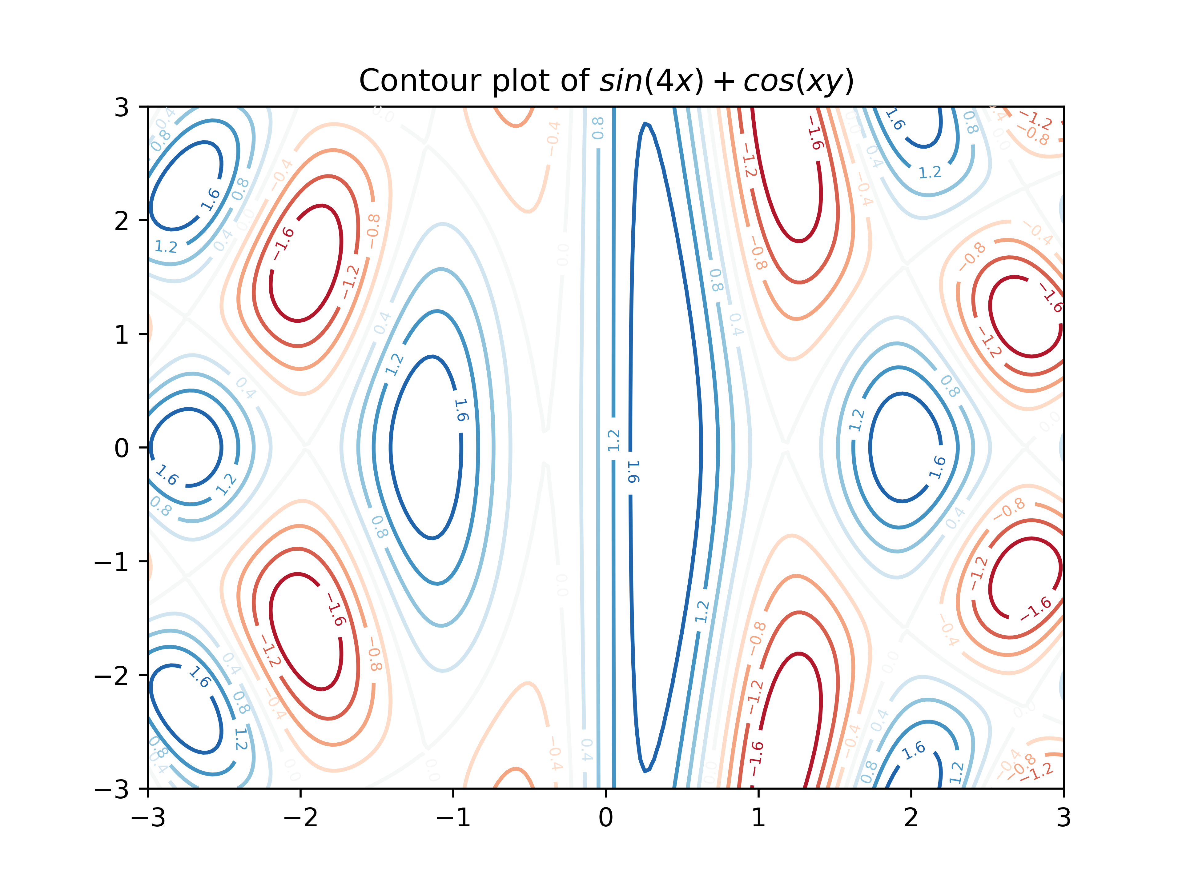
# SOLUTION

def f(x, y):
    return np.sin(x*4) + np.cos(y*x)


xs, ys = np.meshgrid(np.linspace(-3.0, 3.0, 200), np.linspace(-3.0, 3.0, 200))
cs = plt.contour(xs, ys, f(xs, ys), 10, cmap='RdBu')
plt.clabel(cs, cs.levels, inline=True, fontsize=6)
plt.title('Contour plot of $\\sin(4x) + \\cos(xy)$')

plt.savefig('figures/contours.png', dpi=600)
Copyright © 2023–2025 Jon Barker, University of Sheffield. All rights reserved.