050 Exploratory Data Analysis and Visualisation#
COM6018
Copyright © 2023–2025 Jon Barker, University of Sheffield. All rights reserved.
1. Introducing Matplotlib and Seaborn#
Matplotlib is a Python package for generating 2D and 3D plots.
It is based on the plotting tools from MATLAB (hence the name).
It is extremely flexible - all aspects of plots can be controlled programmatically.
It can produce graphs, bar charts, scatter plots, contour and surface plots, etc.
It can produce very high-quality output in numerous formats (png, pdf, svg, etc.)
Seaborn is a Python package for generating statistical plots.
It is based on Matplotlib.
It provides a high-level interface for producing statistical plots.
It can produce plots such as histograms, boxplots, scatter plots, etc.
It can produce plots that are not easy to make using Matplotlib.
This tutorial will run through some of the most common plot types and features and can act as a starting point for your own use of the Matplotlib and Seaborn packages. For full documentation, see https://matplotlib.org and https://seaborn.pydata.org.
The tutorial will first discuss Matplotlib and then introduce Seaborn in the final sections.
1.1 Hello world#
Matplotlib’s basic plotting functionality is provided by the pyplot module. This is usually imported as plt. We will also be using the NumPy package to generate data for the examples. To import both of these packages, use the following commands:
import matplotlib.pyplot as plt
import numpy as np
import warnings
warnings.filterwarnings('ignore')
I have also used the warnings package to suppress some distracting warning messages generated by Matplotlib.
We will now use NumPy to generate some simple data to plot. x will be a vector of 10 values evenly spaced between 0 and 5. y will be the square of x.
x = np.linspace(0, 5, 10)
y = x**2
To plot y against x, we use the plot function from pyplot. To ensure that the plot is displayed, we then call the show function.
plt.plot(x, y)
plt.show()
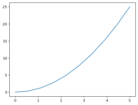
Exactly how the plot is displayed will depend on the environment in which we are working and how we have things configured. Generally, if we are running in a Jupyter notebook, the plot will be displayed inline in the notebook. If we are running the Python code as a script, the plot will be displayed in a separate window.
1.2 A simple plot#
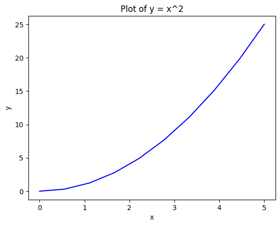
The previous plot displayed the curve but was lacking axis labels, a title, etc. We can add these using various pyplot functions. In the example below, we use xlabel, ylabel and title to add the annotation. We also use plt.figure to start a new figure and plt.show to display the figure. Note also that we have provided a third parameter to the plot function with the value ‘b-’. This specifies the colour and line style of the curve. ‘b-’ means a blue solid line. We can change the colour by using a different first letter; e.g., ‘r-’ would be a red solid line. We can also use other line styles; e.g., ‘r–’ would be a red dashed line, ‘r.’ would be a red dotted line, etc. See the Matplotlib documentation for a full list of colours and line styles.
plt.figure()
plt.plot(x, y, "b-")
plt.xlabel("x")
plt.ylabel("y")
plt.title("Plot of y = x^2")
plt.show()
1.3 Object-oriented API#
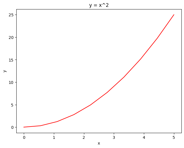
Somewhat confusingly, Matplotlib provides two different APIs for generating plots. The first is the pyplot API which we have been using so far. This is a procedural API that is very similar to the MATLAB plotting API. The second is the object-oriented API. This is more flexible and allows us to have more control over the plot. This will be more useful when we want to produce more complicated plots, e.g., plots with multiple axes in the same figure.
The following example shows how we can use the object-oriented API to produce the same plot as before.
fig = plt.figure()
axes = fig.add_axes([0.1, 0.1, 0.9, 0.9])
axes.plot(x, y, "r-")
axes.set_xlabel("x")
axes.set_ylabel("y")
axes.set_title("y = x^2")
plt.show()
Note
An API is an Application Programming Interface. It is a set of functions and classes that can be used to interact with a software library. The API defines how functions and classes can be used and what parameters they take. The API is the interface between the user and the library.
2 Structuring plots#
We will now introduce some methods for structuring more complex plots. We will see how to add multiple axes to a figure and how to control the layout of the axes. We will also see how to save plots to files and how to add a legend.
2.1 Multiple axes in a figure#
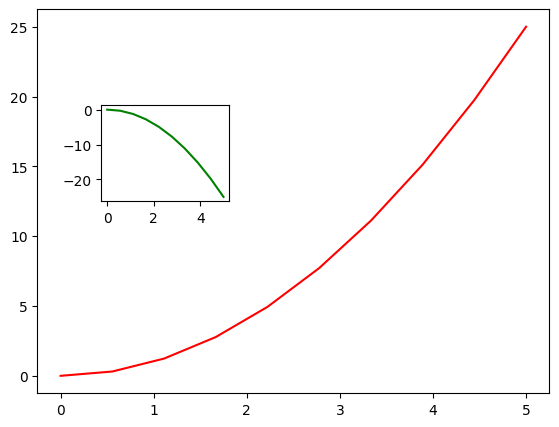
Using the object-oriented AP, we can add multiple axes to a figure using the add_axes method which takes the left, bottom, width and height of the axes (in the range 0 to 1). The following example shows how to add two axes to a figure.
fig = plt.figure()
axes1 = fig.add_axes([0.1, 0.1, 0.8, 0.8])
axes1.plot(x, y, "r-")
axes2 = fig.add_axes([0.2, 0.5, 0.2, 0.2])
axes2.plot(x, -y, "g-")
plt.show()
2.2 Using the subplot layout manager#
If we want a regular grid of axes, we can use the subplots function. This takes two parameters: the number of rows and the number of columns. It returns a figure object and a 2-D NumPy array storing the individual Axes objects. We can then use an array index to select the Axes object on which we wish to plot.
For instance, the following example shows how we might create a 2x2 grid of axes.
fig, axes = plt.subplots(nrows=2, ncols=2)
axes[0, 0].plot(y, x)
axes[1, 0].plot(y, x**x)
axes[1, 1].plot(y, x**2 - x)
fig.tight_layout()  # adjusts spacing to avoid plots overlapping labels
plt.show()
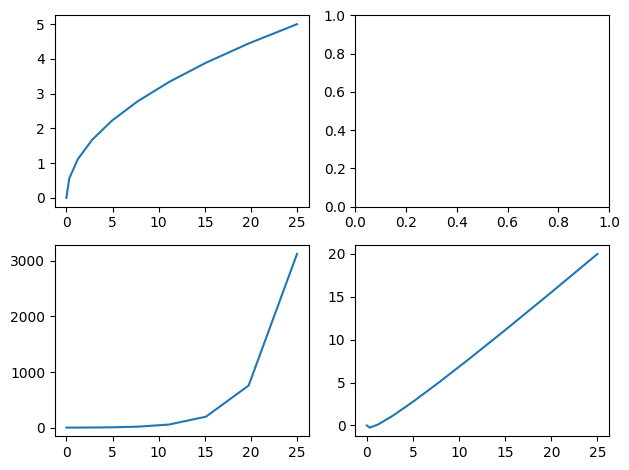
Note the use of the tight_layout function immediately before the call to show. This adjusts the spacing between the axes to make sure the labels do not overlap.
The following example is a little more complicated. After making the axes, it iterates over them using a loop and does the plotting and labeling for each one.
fig, axes = plt.subplots(nrows=2, ncols=3)
for ax in axes.reshape(-1):  # axes is returned as a 2x3 NumPy array; reshape into a vector
    ax.plot(x, y, "r")
    ax.set_ylabel("y axis")
    ax.set_xlabel("x axis")
fig.tight_layout()  # adjusts spacing to avoid plots overlapping labels
plt.show()
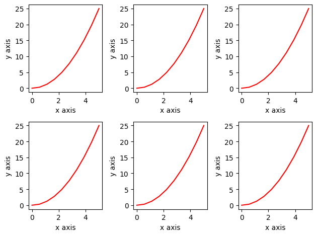
Note the use of the NumPy reshape function, i.e., axes.reshape(-1), which is being used to turn the 2-D array of axes into a 1-D array. This type of reshaping is a common trick in NumPy which makes it easy to iterate over all the elements of a multi-dimensional array without having to use nested loops.
2.3 Setting the figure size#
The size of the figure can be set using the set_size_inches method. Note that this is a method of the figure object, i.e., setting the size of the entire figure, not of the various plots inside the figure. The size is specified in inches. The default size is 6.4 by 4.8 inches.
fig, axes = plt.subplots(nrows=6, ncols=6)
fig.set_size_inches((12, 12))  # defaults to 6.4 by 4.8
for ax in axes.reshape(-1):
    ax.plot(x, y, "r")
    ax.set_ylabel("y axis")
    ax.set_xlabel("x axis")
fig.tight_layout()
plt.show()
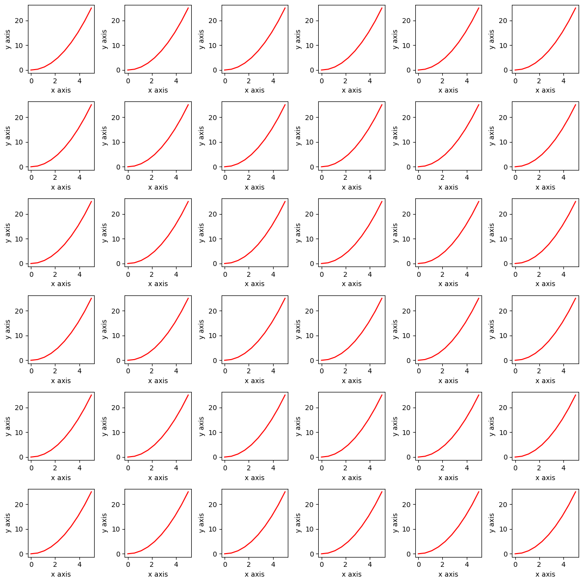
Note above that the set_size_inches method takes a single tuple as its input parameter; hence, the need for the double brackets: the inner brackets are for the tuple.
2.4 Writing to a file#
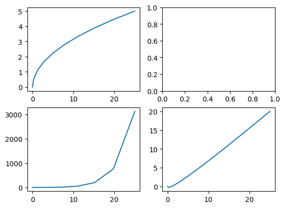
Once we have made a plot, it is very easy to save it to a file, and there are many image file formats that we can use.
To save the figure, we simply use the savefig method of the figure object, as follows,
fig, axes = plt.subplots(nrows=2, ncols=2)
axes[0, 0].plot(y, x)
axes[1, 0].plot(y, x**x)
axes[1, 1].plot(y, x**2 - x)
fig.savefig("figures/myplot.pdf", dpi=200)  # setting 'dots per inch'
plt.show()
Caution
In the above, we are saving to a subdirectory called figures. This directory must exist before running the code, or an error will occur.
The function will infer the file format from the file extension. In the above example, we have saved the plot as a PDF and we have also set the resolution of the figure using the dpi parameter (dpi means dots per inch). The dpi parameter is optional and, if not supplied, defaults to using the figure’s dpi value (which, if not set explicitly, is 100). Setting the dpi to a higher value can be useful if we want to make a high-quality plot for printing.
2.5 Adding a legend#
In the examples so far, we have placed a separate curve on each axis and we can use the title to explain what the curve represents. However, if we want to place multiple curves on the same axis, we need to add a ‘legend’ so that the plot is easy to understand. This can be done using the legend method of the Axes object.
The following example plots the function \(x^2\), \(x^x\) and \(2^x\) on the same axes. Note in the code below that when using the plot method, we have now also specified a label for each curve. The legend method then uses these labels to generate the legend. The loc parameter specifies where the legend should be placed. The value 0 means that Matplotlib should decide where to place the legend (it tries to position it by choosing a corner where it will not overlap with the data), but you can also specify the location explicitly as either upper-right, upper-left, lower-left, or lower-right by using the integers 1, 2, 3 or 4 respectively.
fig, ax = plt.subplots()  # by default returns a single axis
ax.plot(x, x * 2, label="x*2")
ax.plot(x, x * x, label="x^2")
ax.plot(x, 2**x, label="2^x")
ax.legend(loc=0)  # 1=UR, 2=UL, 3=LL, 4=LR, 0=matplotlib decides
plt.show()
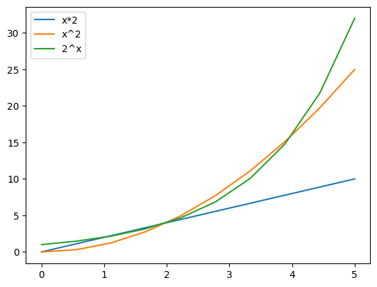
Note that Matplotlib has chosen the line colours.
2.6 Changing colours and linestyles#
Matplotlib provides a lot of flexibility in how plots are displayed. We can control the colour, line style, marker style, etc. of each curve. This is done by setting additional optional parameters to the plot method, e.g. color, linestyle, marker, markersize, etc.
The following example shows how to do this.
fig, ax = plt.subplots()
ax.plot(x, y, label="y", color="purple", linewidth=2, linestyle="-", marker="o", markersize=8)
ax.plot(x, y * 2, label="2y", lw=2, ls="-", marker="o", c="red", ms=8)
ax.plot(x, y * 3, label="3y", lw=2, ls="-.", marker="s", ms=10, mfc="red", mec="blue", mew=2)
ax.plot(x, y * 4, label="4y", lw=2, ls=":", marker="o", c="#ff9915", ms=8)
ax.legend(loc=0)
plt.show()
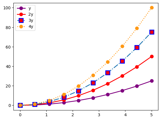
Notice how the legend automatically picks up the corresponding colours and line styles.
Marker symbols can be ‘+’, ‘s’, ‘*’, ‘o’ and many others. See the Matplotlib documentation for a full list.
2.7 Controlling the axes#
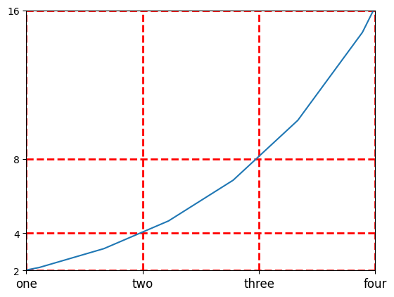
Matplotlib also provides a lot of control over exactly how the axes are displayed. We can control the range, the tick spacing, the tick labels, the grid lines, etc. If we do not specify values explicitly, then Matplotlib works out sensible settings itself (as in the previous examples), but we often want to take control.
The following example shows some examples of how to do this.
fig, ax = plt.subplots()
ax.plot(x, 2**x)
ax.set_xlim([1, 4])  # Setting the x-axis limits
ax.set_ylim([2, 16])  # Setting the y-axis limits
ax.set_yscale("linear")  # can be 'linear' or 'log'
ax.set_yticks([2, 4, 8, 16])  # Specify the tick locations
ax.set_xticks([1, 2, 3, 4])
ax.set_xticklabels(["one", "two", "three", "four"], fontsize=12)
ax.grid(color="red", linewidth=2, linestyle="dashed")  # Add a grid
plt.show()
2.8 Repositioning the spines#
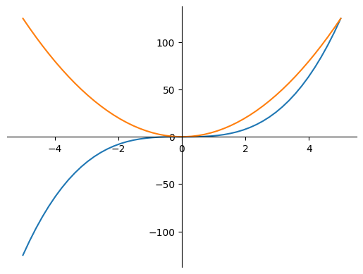
By default, axes will appear along the bottom and left of the plot. This is irrespective of the range of the data and whether the range includes negative values. For more traditional plots, we often want the axes to be positioned at the origin. This can be done using the spines attribute of the Axes object. The following example shows how to do this.
x = np.linspace(-5, 5, 50)
fig, ax = plt.subplots()
ax.plot(x, x**3)
ax.plot(x, x**2 * 5)
ax.spines["left"].set_position(("data", 0))
ax.spines["bottom"].set_position(("data", 0))
ax.spines["top"].set_color("none")
ax.spines["right"].set_color("none")
ax.axis("tight")
plt.show()
2.9 Adding text#
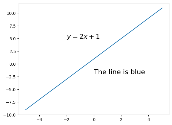
Additional text annotations can be added to a plot using the text method of the Axes object. This takes the x and y coordinates of the text and the text string. Optional parameters such as fontsize can be used to control the appearance of the text.
The following example shows how to do this.
x = np.linspace(-5, 5, 10)
fig, ax = plt.subplots()
ax.plot(x, x * 2 + 1)
ax.text(0, -2, "The line is blue", fontsize=16)
ax.text(-2, 5, "$y=2x+1$", fontsize=16)
plt.show()
2.10 More complex figure layouts#
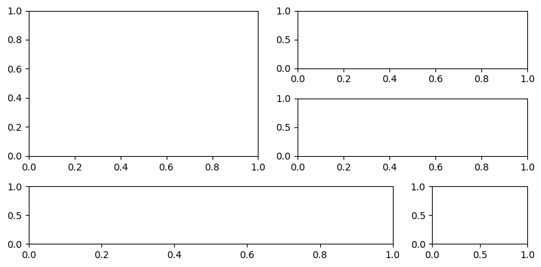
For more flexible layouts, we can use subplot2grid. This allows us to specify the number of rows and columns in the figure and the position of each axis, but it also allows axes to span multiple rows and columns. The following example shows how to do this.
fig = plt.figure()
fig.set_size_inches((8, 4))
## subplot2grid((nrows, ncols), (row_pos, col_pos))
ax1 = plt.subplot2grid((3, 4), (0, 0), colspan=2, rowspan=2)
ax2 = plt.subplot2grid((3, 4), (0, 2), colspan=2, rowspan=1)
ax3 = plt.subplot2grid((3, 4), (1, 2), colspan=2, rowspan=1)
ax4 = plt.subplot2grid((3, 4), (2, 0), colspan=3, rowspan=1)
ax5 = plt.subplot2grid((3, 4), (2, 3), colspan=1, rowspan=1)
fig.tight_layout()
plt.show()
3 Other plot types#
So far we have seen how to plot curves using the plot method. Matplotlib can also be used to plot other types of data. In this section, we will see how to plot shaded regions, histograms and scatter plots. We will also see how to generate 3D plots.
3.1 Histograms and bar charts#
Histograms and bar charts are often confused. A histogram is used to show the distribution of a set of continuous data. A bar chart is used to show the values of a set of discrete categories. We can plot both histograms and bar charts using Matplotlib, but we use different functions for each.
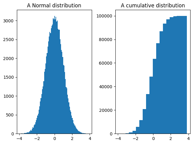
If we have a set of data points, we can display the distribution of the data as a histogram using the hist method. This takes the data as a parameter and optionally the number of bins to use. The same method can also be used to plot a cumulative histogram by setting the cumulative parameter to True.
In the example below, we used the np.random.randn function to produce a set of 100,000 random numbers from a normal distribution. We then plot the histogram and the cumulative histogram.
x = np.random.randn(100000)
fig, ax = plt.subplots(nrows=1, ncols=2)
ax[0].hist(x, bins=100)
ax[0].set_title("A Normal distribution")
ax[1].hist(x, cumulative=True, bins=20)
ax[1].set_title("A cumulative distribution")
fig.tight_layout()
plt.show()
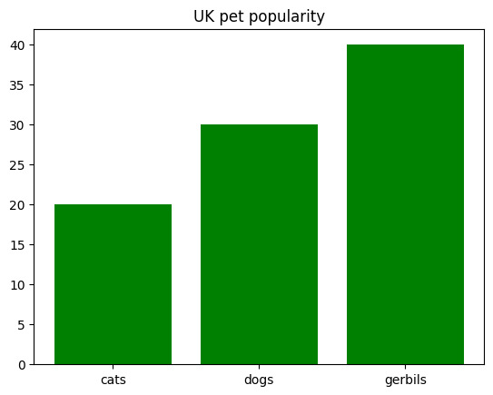
Matplotlib also provides a function called ‘bar’ for plotting bar charts. Do not confuse this with the ‘hist’ function. A bar chart is used to plot categorical data. In this case, we provide a list of labels and a list of values. The following example shows how to do this.
fig, ax = plt.subplots()
## Draw a bar chart
ax.bar(['cats', 'dogs', 'gerbils'], [20, 30, 40], color="green")
ax.set_title("UK pet popularity")
plt.show()
3.2 Scatter plots#
Often in data science, we want to look at the relationship between a pair of variables. For example, we might want to see if there is a correlation between the height and weight of people sampled from some population. In this case, we can use a scatter plot. This is a plot where each sample is represented by a point on the plot and we place the sample according to the value of the two variables.
The following example shows how to do this.
x1 = np.random.randn(1000)
x2 = 15 * x1 + 10 + np.random.randn(1000)
fig, ax = plt.subplots()
ax.scatter(x1, x2)
plt.show()
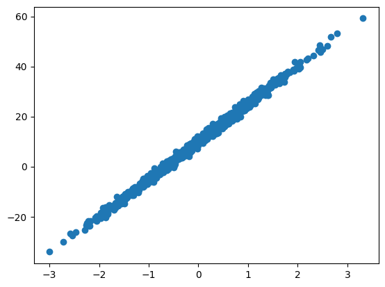
In the above, we have 1000 samples each with two features, x1 and x2. The scatter plot gives us a clear indication of the relationship between the two variables. In this case, we can see that the points are clustered around a straight line. This indicates that there is a strong correlation between the two variables. This is not surprising in this case because x2 has been constructed from a linear function of x1 (that is, \(15 x_1 + 10\)) with some random noise added.
3.3 3D plots#
Matplotlib can also be used to make plots showing the relationship between three variables, e.g., imagine that we have a value \(z\) that is a function of \(x\) and \(y\). This kind of plot can be shown as a 3D surface plot, a contour plot, or as a colour-mapped image.
For example, imagine that we want to visualise the function \(z = cos(x) + sin(y)\). We first use NumPy to generate a grid of \(x\) and \(y\) values. We then use these to compute a value \(z\) for each point on the grid. Finally, we use Matplotlib to plot the values of \(z\) as a 3D surface plot.
axis = np.linspace(-5, 5, 100)
# generate matrices X and Y storing a grid of X and Y pixel coordinates
(X, Y) = np.meshgrid(axis, axis)
# perform some operation on the coordinates to get a grid of Z values
Z = np.cos(X) + np.sin(Y)
We can now display the \(z\) value using imshow. This is a function for displaying 2D arrays as images. The following example shows how to do this.
fig, ax = plt.subplots()
ax.imshow(Z, extent=[-5, 5, -5, 5])  # 'extent' used to set axes labels correctly
plt.show()
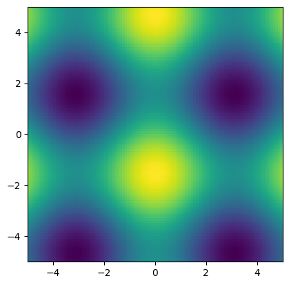
Contour plots and surfaces can be made in a similar way, and examples are shown in the next section.
4 Advanced plotting#
This section illustrates just a few of Matplotlib’s more advanced features.
4.1. Colouring in regions#
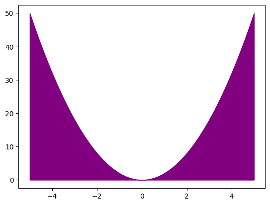
We can easily shade in regions between curves using the fill_between method. This takes the x and y values of the two curves and fills in the region between them. The following example shows how to do this.
fig, ax = plt.subplots()

## Shade the region between two curves
x = np.linspace(-5, 5, 50)
ax.fill_between(x, 0, x**2 * 2, color="purple")
ax.axis("tight")
plt.show()
4.2 Changing the colourmap#
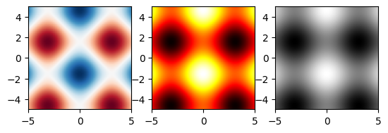
In the previous section, we saw how to display a 2-D array of data as an image using imshow. By default, when we did this, the colours ranged between dark blue (low values) and yellow (high values). This behaviour can be changed by setting the cmap parameter to change the colourmap. Matplotlib provides predefined colourmaps with names such as plt.cm.viridis, plt.cm.hot, plt.cm.RdBu, etc. The default colourmap is plt.cm.viridis.
The following example shows how to do this. The same data as used in the previous section are replotted using three different colourmaps.
fig, ax = plt.subplots(nrows=1, ncols=3)
ax[0].imshow(Z, cmap=plt.cm.RdBu, extent=[-5, 5, -5, 5])
ax[1].imshow(Z, cmap=plt.cm.hot, extent=[-5, 5, -5, 5])
ax[2].imshow(Z, cmap=plt.cm.gray, extent=[-5, 5, -5, 5])  # Note US spelling: 'gray'
plt.show()
help(plt.cm) # see the full list of predefined colourmaps
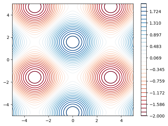
4.3 Generating a contour plot#
The code below uses the same data, but now displays the z value using a contour map.
fig, ax = plt.subplots()
levels = np.linspace(-2, 2, 30)
im = ax.contour(Z, cmap=plt.cm.RdBu, extent=[-5, 5, -5, 5], levels=levels)
fig.colorbar(im, ax=ax)
plt.show()
4.4 Making 3D figures#
We can plot our X, Y, Z data from the previous section as a surface plot or as a wireframe plot. The following example shows how to do this.
fig = plt.figure(figsize=(8, 4))
ax1 = fig.add_subplot(1, 2, 1, projection="3d")  # generate an Axes3D
im = ax1.plot_surface(X, Y, Z, cmap=plt.cm.gray)
ax2 = fig.add_subplot(1, 2, 2, projection="3d")  # generate an Axes3D
im = ax2.plot_wireframe(X, Y, Z, rstride=4, cstride=4)
plt.show()
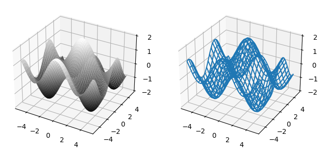
Note that these plots are displayed on 3D axes. For documentation on how to control 3D axes, see the documentation for the Axes3D class which can be found in the mpl_toolkits.mplot3d.axes3d module.
from mpl_toolkits.mplot3d.axes3d import Axes3D
help(Axes3D)
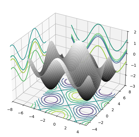
4.5 Adding 2D projections to a 3D plot#
We can also add 2D projections to a 3D plot. The following example shows how to do this.
fig = plt.figure(figsize=(14, 6))
ax = fig.add_subplot(1, 2, 1, projection="3d")  # generate an Axes3D
ax.plot_surface(X, Y, Z, cmap=plt.cm.gray)
ax.contour(X, Y, Z, zdir="z", offset=-3)
ax.contour(X, Y, Z, zdir="x", offset=-8)
ax.contour(X, Y, Z, zdir="y", offset=+8)
ax.set_xlim3d(-8, 5)
ax.set_ylim3d(-5, 8)
ax.set_zlim3d(-3, 2)
plt.show()
4.6 Generating Animations#
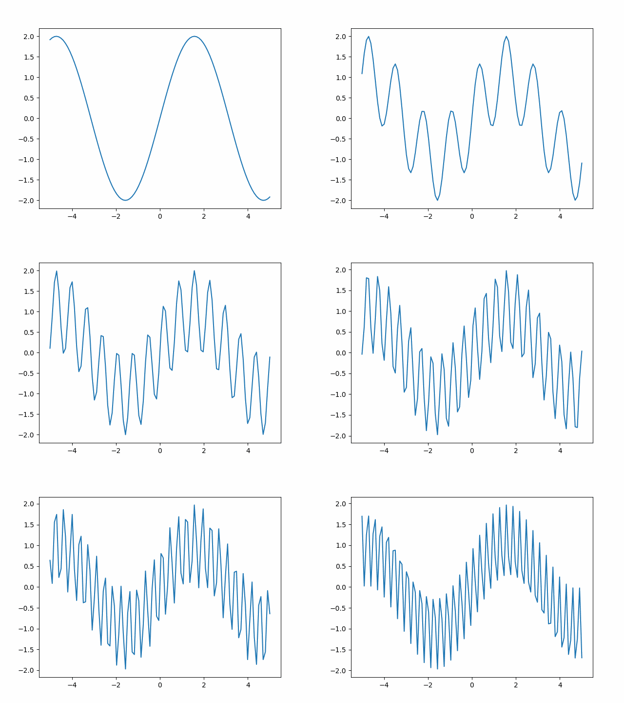
In this final subsection, we show how you can make animations using Matplotlib. This is done using the animation module. This module provides a function called FuncAnimation that takes a figure and a function as parameters. The function it is passed should itself have a single integer ‘frame index’ parameter. The FuncAnimation function will call the function it has been passed multiple times, each time with a new frame index. We can decide how many frames to generate by using FuncAnimation’s integer frames parameter. The FuncAnimation method returns an animation object. We can then call the save method of the animation object to save it to an animated gif file.
This all sounds very complicated, but it can be made clear by an example:
from matplotlib import animation

fig, ax = plt.subplots()


def update(frame_counter):
    ax.cla()
    x = np.linspace(-5, 5, 100)
    y = np.sin(x * (1.0 + frame_counter / 10.0)) + np.sin(x)
    ax.plot(x, y)


anim = animation.FuncAnimation(fig, update, frames=200)
anim.save("figures/animation.gif", fps=20)
MovieWriter ffmpeg unavailable; using Pillow instead.
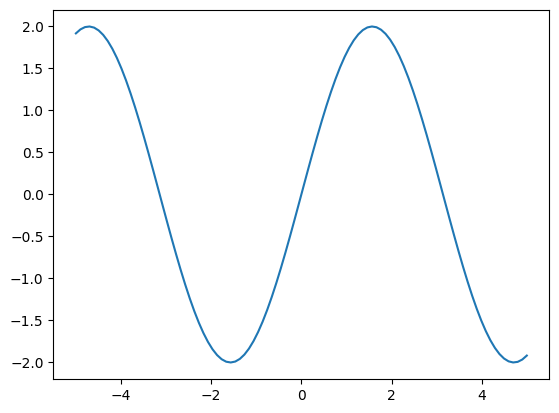
The resulting gif file is shown below.
Caution
In the above, we are saving to a subdirectory called figures. This directory must exist before running the code, or an error will occur.
5 Introducing Seaborn#
Seaborn is a Python package for generating statistical plots. It is based on Matplotlib but provides a higher-level interface that reduces the amount of code that we need to write ourselves. It can produce plots such as histograms, boxplots, scatter plots, etc. It can produce plots with a single line of code that would not be easy to make using Matplotlib directly.
To use Seaborn, we must first import the package. It is conventional to import it as sns.
import seaborn as sns
Seaborn comes with some built-in datasets that can be used for testing and demonstrations. We can load these using the load_dataset function. The following example loads the mpg dataset, which contains data on the fuel consumption of various cars.
mpg = sns.load_dataset("mpg")
The data is returned as a Pandas DataFrame (Seaborn has been designed to work with Pandas). We can use the DataFrame head method to display the first few rows of the DataFrame.
print(mpg.head())
    mpg  cylinders  displacement  horsepower  weight  acceleration  \
0  18.0          8         307.0       130.0    3504          12.0
1  15.0          8         350.0       165.0    3693          11.5
2  18.0          8         318.0       150.0    3436          11.0
3  16.0          8         304.0       150.0    3433          12.0
4  17.0          8         302.0       140.0    3449          10.5

   model_year origin                       name
0          70    usa  chevrolet chevelle malibu
1          70    usa          buick skylark 320
2          70    usa         plymouth satellite
3          70    usa              amc rebel sst
4          70    usa                ford torino
Seaborn has extensive functionality for visualising data. In the sections below, we will consider visualising statistical relationships between variables, visualising distributions of data, and visualising categorical data. For further examples, see the Seaborn documentation and in particular the tutorial sections https://seaborn.pydata.org/tutorial.html.
Note that Seaborn also provides a number of different ‘themes’, i.e., different styles for the plots. The default theme is called ‘darkgrid’. We can change the theme using the set_style function. The following example shows how to do this.
sns.set_style("whitegrid")
For a full list of themes, see the Seaborn documentation.
5.1 Visualising statistical relationships#
Relationships between variables can be visualised using the relplot function. This can be used to generate scatter plots, line plots, etc.
By default, the relplot function will generate a scatter plot. The following example shows how to show the relationship between the horsepower and mpg variables for all the cars in the mpg dataset.
sns.relplot(data=mpg, x="horsepower", y="mpg")
plt.show()
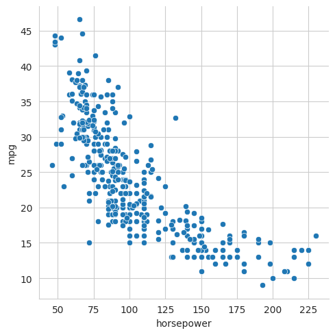
Note that we could have produced this plot using Matplotlib directly, but it would have taken a lot more code, i.e., we would have had to extract the data from the DataFrame, label the axes, set up the grid, etc.
However, the real power of Seaborn is that it makes it very easy for us to generate more sophisticated plots. For example, say that we wanted to use the size of each point in the scatter plot to show a third variable, e.g., the weight of the car. This can be done simply by setting the size parameter and selecting the variable we want to attach to it, i.e., ‘weight’.
The following example shows how to do this.
sns.relplot(data=mpg, x="horsepower", y="mpg", size="weight")
plt.show()
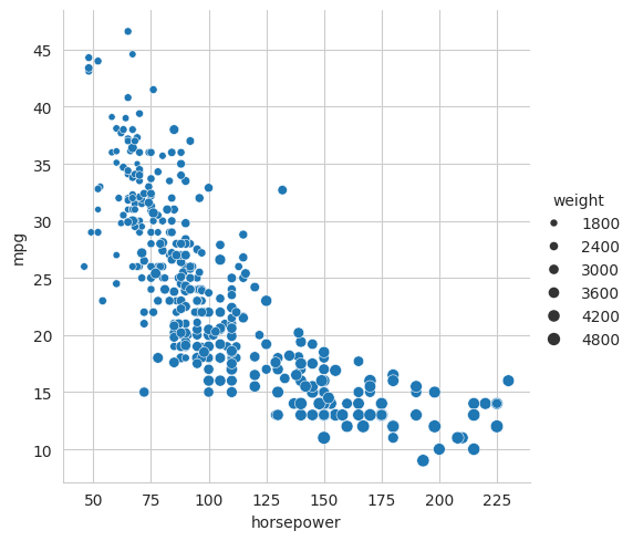
Note how Seaborn has automatically labelled the axes for us and added a legend.
We can also use the colour of each point to show a fourth variable. This can be done by setting the hue parameter. The following example shows how to do this.
sns.relplot(data=mpg, x="horsepower", y="mpg", size="weight", hue="origin")
plt.show()
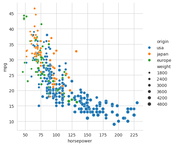
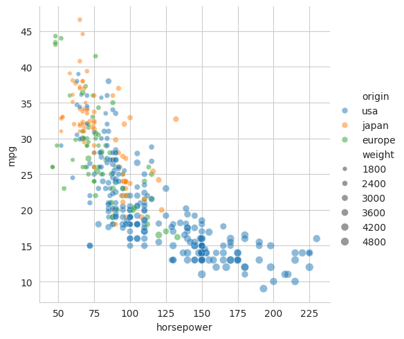
From this plot we can see that cars from Japan and Europe tend to be lighter and more fuel efficient than cars from the United States. Note that this dataset consists of cars from the 1970s and 1980s. The differences between the regions may be less pronounced in more recent years. Petrol used to be very cheap in the USA, so fuel efficiency was not a priority, whereas, in recent years, cars have become heavier in order to provide more protection in accidents.
The relplot function can also be used to generate line plots. Here we would set the kind parameter to line. The following example shows how to do this.
sns.relplot(data=mpg, x="horsepower", y="mpg", kind="line")
plt.show()
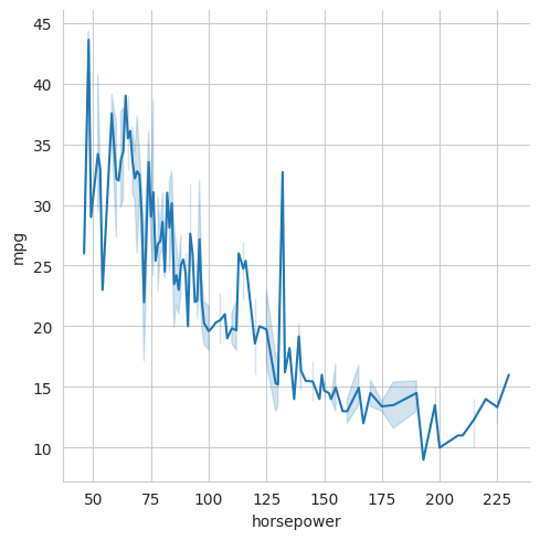
It is important to think carefully about whether to use a line plot or a scatter plot. Line plots emphasise the continuity of the data along the x-axis. A scatter plot emphasises the individual data points. In this particular case, the scatter plot is probably more appropriate because each point represents a different car and there is no continuity between cars.
When there are a lot of points, scatter plots can become very cluttered and points start to occlude each other. This can make it difficult to get a true impression of the distribution of the data. One solution to this is to make the points semi-transparent so that the overlapped points are more visible. This can be done by setting the alpha parameter. The alpha value ranges between 0 and 1 with 0 meaning fully transparent and 1 meaning fully opaque. The following example shows how to do this.
sns.relplot(data=mpg, x="horsepower", y="mpg", size="weight", hue="origin", alpha=0.5)
plt.show()
In the above plots, we have tried to show several variables on the same axes. An alternative approach, particularly for categorical variables, is to use multiple axes. Seaborn has the concept of a FacetGrid which is a grid of axes. Each axis shows a different subset of the data. A FacetGrid can be constructed simply by setting the col and/or row parameters.
For example, to make a grid of plots where the columns represent the different origins (‘usa’, ‘japan’ and ‘europe’) and the rows represent the number of cylinders in the car’s engine, we would use the following,
sns.relplot(data=mpg, x="horsepower", y="mpg", col="origin", row="cylinders", height=2.5)
plt.show()
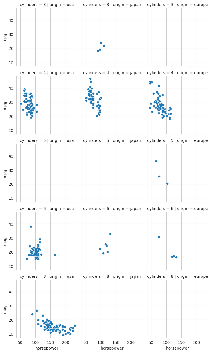
In the above, the height parameter is used to set the height of each plot in the grid. The default height is 5 inches. Here we have reduced it to 2.5 so that the entire grid fits on the page a bit better. Note that some of the plots have no data, i.e., there are no 8-cylinder cars from Europe or Japan in this dataset.
5.2 Visualising distributions of data#
When we have a new set of data, one of the first things we want to do is to understand something about its distribution, e.g., What is its range? Is the data clustered about a single value or are there multiple clusters? Is the data symmetrically distributed about a central value or is it skewed? etc. These questions can be answered by plotting the distribution of the data using, for example, a histogram plot.
In Seaborn, distributions are plotted using the displot function. This can be used to generate histograms, kernel density (KDE) plots and rug plots.
5.2.1 Plotting univariate distributions#
The displot has a parameter called kind which determines the type of plot that will be generated. To examine the distribution of a single variable, i.e., a ‘univariate’ distribution, a simple histogram is often the best tool and we would use kind='hist'. (However, as hist is the default kind, we do not need to specify it explicitly.)
For example, to view the distribution of the weights of cars in our dataset, we would use the following.
sns.displot(mpg, x="weight")
plt.show()
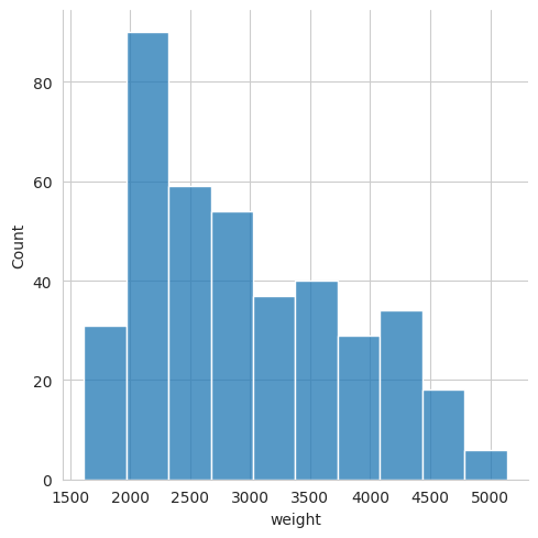
Seaborn has automatically chosen the number of bins to use in the histogram. It tries to pick something that is sensible based on the variance of the data and the number of samples. However, we can override this by setting the bins parameter. For example, if we wanted to use 20 bins, we would use the following,
sns.displot(mpg, x="weight", bins=20)
plt.show()
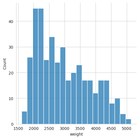
Or we can specify a bin width. For example, if we want each bin to represent a 200 kg range, we would use the following,
sns.displot(mpg, x="weight", binwidth=200)
plt.show()
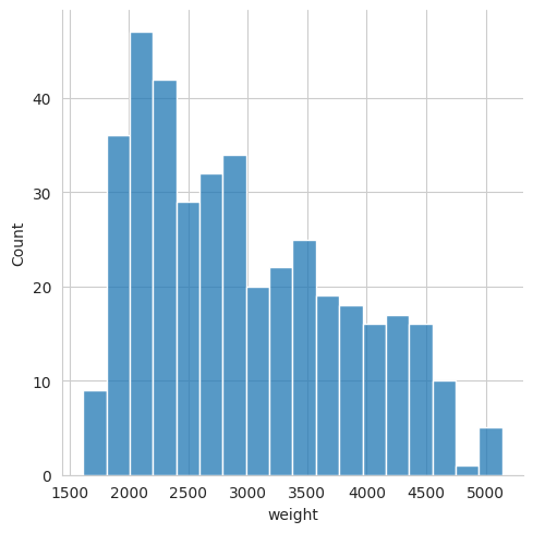
In the previous plots, we have created a single histogram for the entire car database. Let us say that we instead wanted to see the distribution of the car weights for each origin separately, i.e., separate distributions for Japan, US and Europe. To do this, we can introduce the hue parameter to get separate histograms for each region, each one in a different colour.
sns.displot(mpg, x="weight", hue="origin")
plt.show()
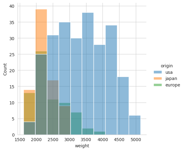
In this case, the result is not very clear because the distributions have a large overlap. We can make things clearer by using the multiple parameter which can be set to stack to make a stacked histogram, or dodge to make interlaced histograms. For example, using the dodge option would look like this,
sns.displot(mpg, x="weight", hue="origin", multiple="dodge")
plt.show()
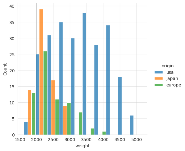
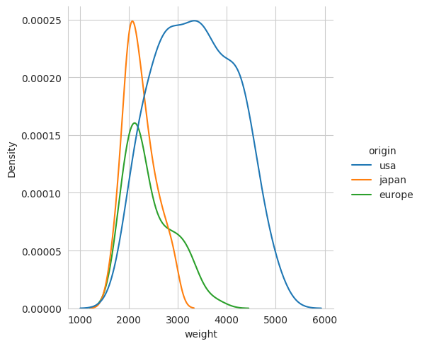
As an alternative to a histogram, we can also plot the distribution of data using a kernel density plot. This is a smoothed version of a histogram. It is a good way to visualise the distribution of data when there are a large number of samples. To make a kernel density plot we use kind='kde'. For example, to make a kernel density plot of the weight of cars we would use the following,
sns.displot(mpg, x="weight", hue="origin", kind="kde")
plt.show()
5.2.2 Plotting bivariate distributions#
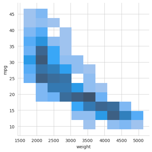
If we want to look at the distribution of a pair of variables (i.e., a bivariate distribution), we still use the displot, but we now also provide a value for the ‘y’ parameter. This will produce a 2-D histogram, i.e., a grid in which the shading of the tiles in the grid is used to indicate the number of samples in each bin.
For example, to plot the distribution of weight against mpg, we would use the following,
sns.displot(mpg, x="weight", y="mpg")
plt.show()
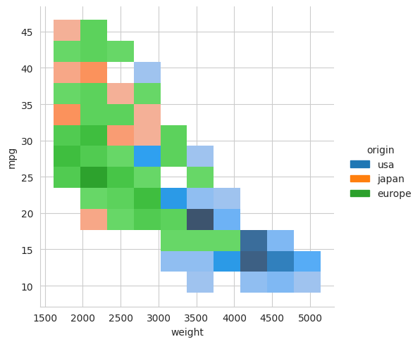
Again, we can generate a separate histogram for different categories in our data by using the ‘hue’ parameter. For example, to make a histogram for each region, we would use the following,
sns.displot(mpg, x="weight", y="mpg", hue="origin")
plt.show()
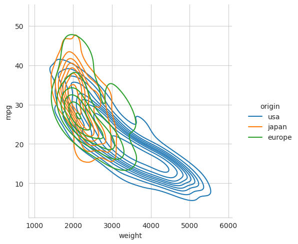
Again, we could choose to use a kernel density plot instead of a histogram by setting the kind parameter to kde. This would then produce smoothed contour plots to show the distribution of data. For this particular dataset, there are not enough samples to use KDE, and the result is unsatisfactory, but the code is shown below for reference.
sns.displot(mpg, x="weight", y="mpg", hue="origin", kind="kde")
plt.show()
Finally, Seaborn also provides jointplot, a figure-level plotting function that can combine plot types to show both a joint distribution and its marginal distributions in the same figure.
For example,
sns.jointplot(data=mpg, x="weight", y="mpg")
plt.show()
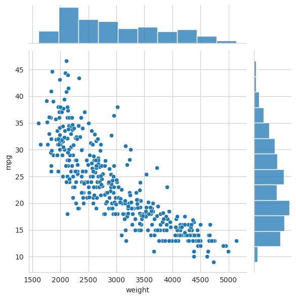
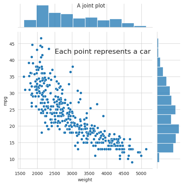
For all Seaborn plots, if we want to tailor details of the figure’s appearance we can easily do so by using additional Matplotlib functions. To do this we need to get the Matplotlib figure object that is stored as an attribute of the Seaborn plot object returned by the Seaborn plotting function.
For example, to change the title and add some additional text,
g = sns.jointplot(data=mpg, x="weight", y="mpg")
# 'g' is a Seaborn plot object. It has a 'fig' attribute that stores the Matplotlib figure object
matplotlib_figure = g.fig
# We can now use Matplotlib functions to customise the figure
matplotlib_figure.suptitle("A joint plot")
ax = g.ax_joint  # get the main axes
ax.text(2500, 42, "Each point represents a car", fontsize=16)
plt.show()
5.2.3 Plotting multiple distributions#
If we want to get a quick overview of the relationship between all pairs of variables in a dataset, we can use the pairplot function. This will generate a grid of plots showing the distribution of each pair of variables. The following example shows how to do this.
sns.pairplot(mpg)
plt.show()
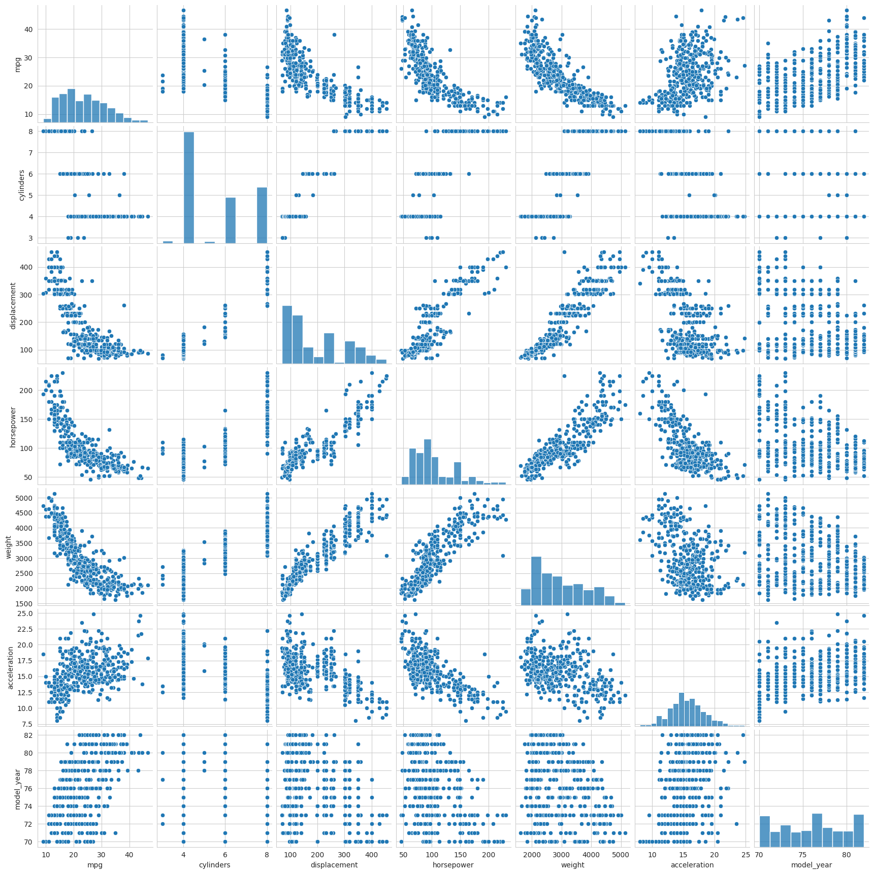
See the online tutorial for how we can customise these distribution plots further. https://seaborn.pydata.org/tutorial/distributions.html#
5.3 Visualising categorical data#
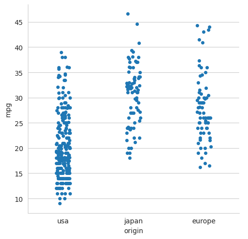
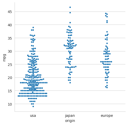
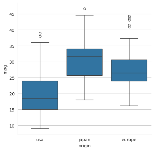
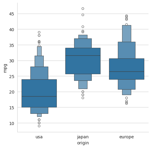
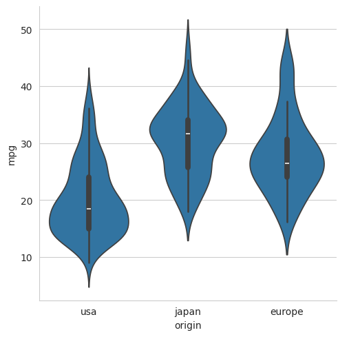
In the previous section, we looked at how we could visualise the relationship between pairs of variables. The scatter plots, histograms and kernel density plots are most appropriate when both of the variables are continuous. However, we often want to visualise the relationship between a continuous variable and a categorical variable. For example, we might want to visualise the relationship between the weight of a car and its origin. In this case, there are more specialised categorical plots that we can use. These would include strip plots, swarm plots, box plots, boxen plots and violin plots. In Seaborn, these plots are all produced using the catplot function and setting the kind parameter to select the type of plot we require.
In the following examples, we will use catplot to show the relationship between the fuel efficiency of a car and its origin.
5.3.1 A strip plot#
sns.catplot(data=mpg, x='origin', y='mpg', kind='strip')
plt.show()
5.3.2 A ‘swarm’ plot#
sns.catplot(data=mpg, x='origin', y='mpg', kind='swarm', size=4)
# The default marker size value has been reduced to 4 for display purposes
plt.show()
5.3.3 A box plot#
sns.catplot(data=mpg, x='origin', y='mpg', kind='box')
plt.show()
5.3.4 A boxen plot#
sns.catplot(data=mpg, x='origin', y='mpg', kind='boxen')
plt.show()
5.3.5 A violin plot#
sns.catplot(data=mpg, x="origin", y="mpg", kind='violin')
plt.show()
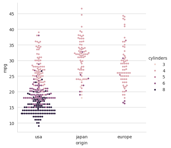
All of these plots can be customised in various ways using the ideas that we have seen previously. For example, we can use the hue parameter to introduce a third variable. For example, to show the relationship between the weight of a car, its origin and the number of cylinders in its engine, we would use the following.
sns.catplot(data=mpg, x='origin', y='mpg', hue='cylinders', kind='swarm', size=4)
plt.show()
6 Summary#
Matplotlib and Seaborn are very large and sophisticated packages for visualising data in Python. Matplotlib works at a lower level than Seaborn. It is highly flexible and allows for very precise control but can be a little verbose, i.e., requiring quite a few lines of code to configure each plot. Seaborn is a higher-level package that is built on top of Matplotlib and provides a more convenient interface for common statistical plots. It interfaces elegantly with Pandas DataFrames and makes it very easy to generate plots that show the relationship between multiple variables.
Seaborn is very useful for initial data exploration where we are using plots to get a feel for the data and to identify interesting relationships. However, if we want to produce a publication-quality plot, we may need to use additional Matplotlib functionality to obtain the precise control that we need. e.g., to meet the style guidelines of a particular journal.
In this tutorial,
we have seen examples of some of the most common plot types,
we have seen how plots can be built in Matplotlib using its object-based API,
we have seen some of the more sophisticated functionality for 3D plots, animations, etc.
we have seen how Seaborn can be used to generate statistical plots.
Many details and features have not been covered, but both packages are very well documented. For documentation and further examples, see https://matplotlib.org and https://seaborn.pydata.org.
Copyright © 2023–2025 Jon Barker, University of Sheffield. All rights reserved.


